Portfolio Categories Branding
-1
archive,tax-portfolio_category,term-branding,term-57,stockholm-core-2.3.2,select-child-theme-ver-1.1.1,select-theme-ver-9.8,ajax_fade,page_not_loaded,vertical_menu_enabled, vertical_menu_transparency vertical_menu_transparency_on,,qode_menu_,wpb-js-composer js-comp-ver-8.3.1,vc_responsive

Whale Tail Brewery

Mamut built the identity and brand strategy for Whale Tail Brewery, a beer naturally crafted in Uvita, one of the most wild beaches of Costa Rica. Located close to Bahía Ballena is from where the mark born and spreads it sophisticated beachy style.

Scala

Brand and Visual identity developed for a new fancy restaurant concept that offers to go one step further in the sense of taste. Scala concept is to elevate the customers culinary experience, based on a fusion of Costa Rican and international flavors in a stylish location at the beach.

Cavanga Wine Experience

Cavanga is a project that seeks to bring young people closer to wine. Take away the conservatism and rigidity of a tasting and get us all closer to a magical drink.

The Mamut team built this identity around a sophisticated but playful mark featuring a an interesting pattern of sparkling bubbles and a balanced color palette related to wine.

Sinapi

Sinapi is a technology company based in Argentina specialized in process improvement and localization business. Sinapi works with clients around the world. With an image that no longer reflected its growth and development, Sinapi contacted us to carry out an integral rebranding. This new brand not only transmits the essence of Sinapi (mustard in Latin) which reflects a large tree that is born from a small seed, but also communicates that is an updated, solid and constantly growing brand.

Copa Club

This idea was developed at the time that Federico Alonso served as Brand Design Leader at Gensler. Based on the architectural concept of Modern Hacienda, Federico expressed the Copa Club’s branding guidelines in the most important airports of America.

Based on the Hub of the America’s logo, the brand was deconstructed until it achieved a solid graphic assembly for each area of the lounge. Furniture, pots, typical hats and imagery. The essence of the brand is present from the front desk to the custom mosaics developed for the project.

Pico e’Gallo Digital Studio

Mamut designed the new identity for Pico e Gallo (Rooster’s beak), a company that develops websites, digital applications and software. This rebranding emphasized the letter «e», which functions as a link between the two words. Giving the icon a strong and modern personality.

The Private Chef

Identity designed for a gastronomic venture in the southern Pacific of Costa Rica. The brand is based on a mix of shapes that can represent both a seashell, a seed or local product or a chef’s hat. With an elegant color palette that denotes the sophisticated style of cuisine offered to tourists and locals.

Fundación de Parques Nacionales

Good brands generally have some element that makes them memorable. The National Parks Foundation of Costa Rica had a logo depicted by the photographic image of a typical leaf and an insect, but they needed to go further, demonstrate that the hand of man is present and can also help nature, that its footprint is not only destructive but it also protects and safeguards.

From this concept we create a new brand that continues to focus on the leaf as a representative symbol of the nature of Costa Rica, but its veins are formed by the lines of a human fingerprint. Now the Foundation has a stronger, more replicable, iconic and conceptual brand.

Scouts CR

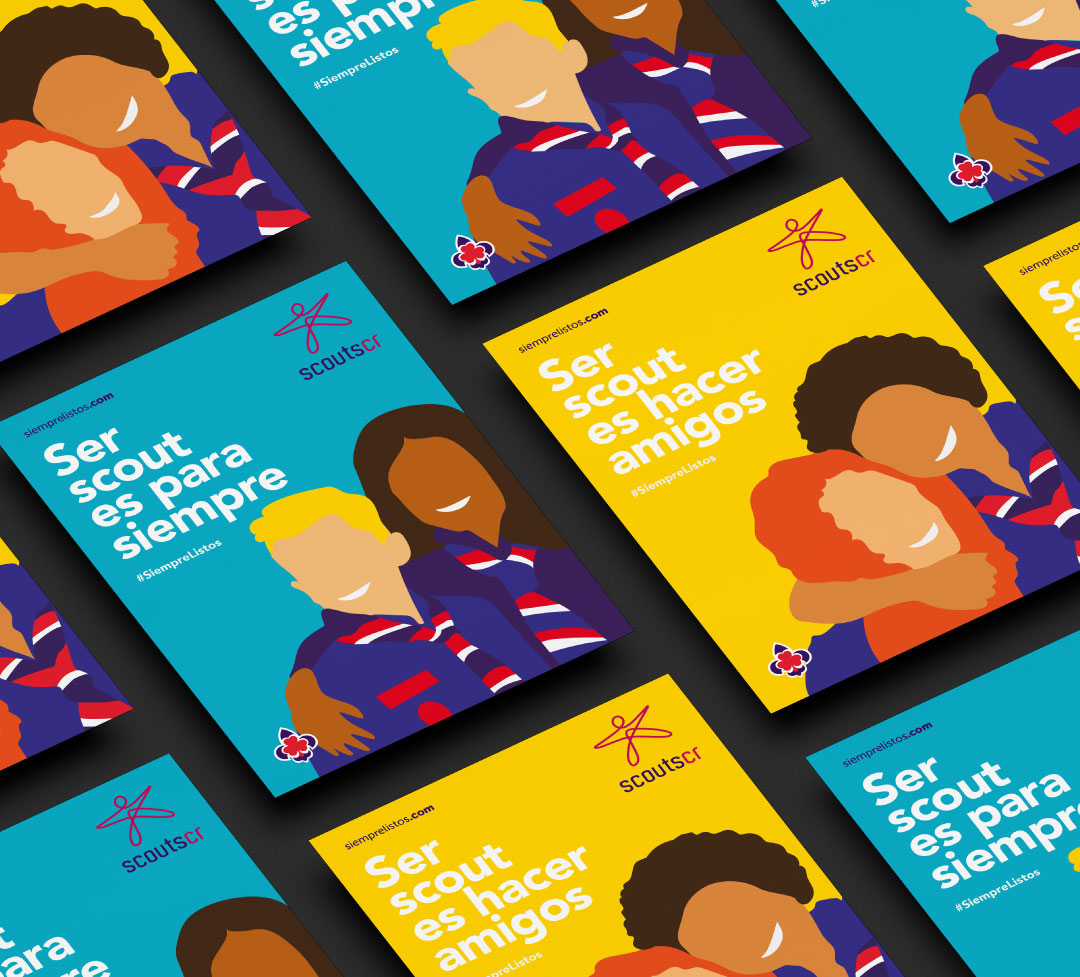
Mamut worked closely with the leadership of the Costa Rican Scouts to update their emblem and create their new communications brand.

An arduous but challenging path when it comes to maintaining the essence of a symbol and being able to establish a refreshment that would enforce the national colors as many Scout institutions in other countries had achieved in recent years. We did this through creating a new contemporary fleur-de-lis and clover that will be immediately recognizable, and more usable in print, fabric and digital.

Along with this, the double challenge of being able to generate a brand with commercial overtones and attractive to the external public but at the same time faithfully representing the essence of Scouting.

Thus, inspired by a foundational element such as rope, a brand without age, without gender, without race was born, a brand that represents them all and has the dynamism and energy that the institution was looking for.

El Arreo

Visual identity and packaging range for one of Costa Rica’s most popular meat producer that increased sales by 60%. A total redesign of El Arreo’s complete line of beef patties. Greater visibility at the point of sale and a firm positioning as a premium raw material brand. This redesign provided the brand with visual and typographic elements that expanded to various product lines.